Simplify a high-frequency AI workflow surface.
I focused on how the header should teach itself while still feeling lighter and more consolidated.
Project / 04
A ServiceNow internship exploration for Dynamic Window focused on consolidating six key actions into one clearer header, then supporting discoverability with lightweight onboarding tooltips.
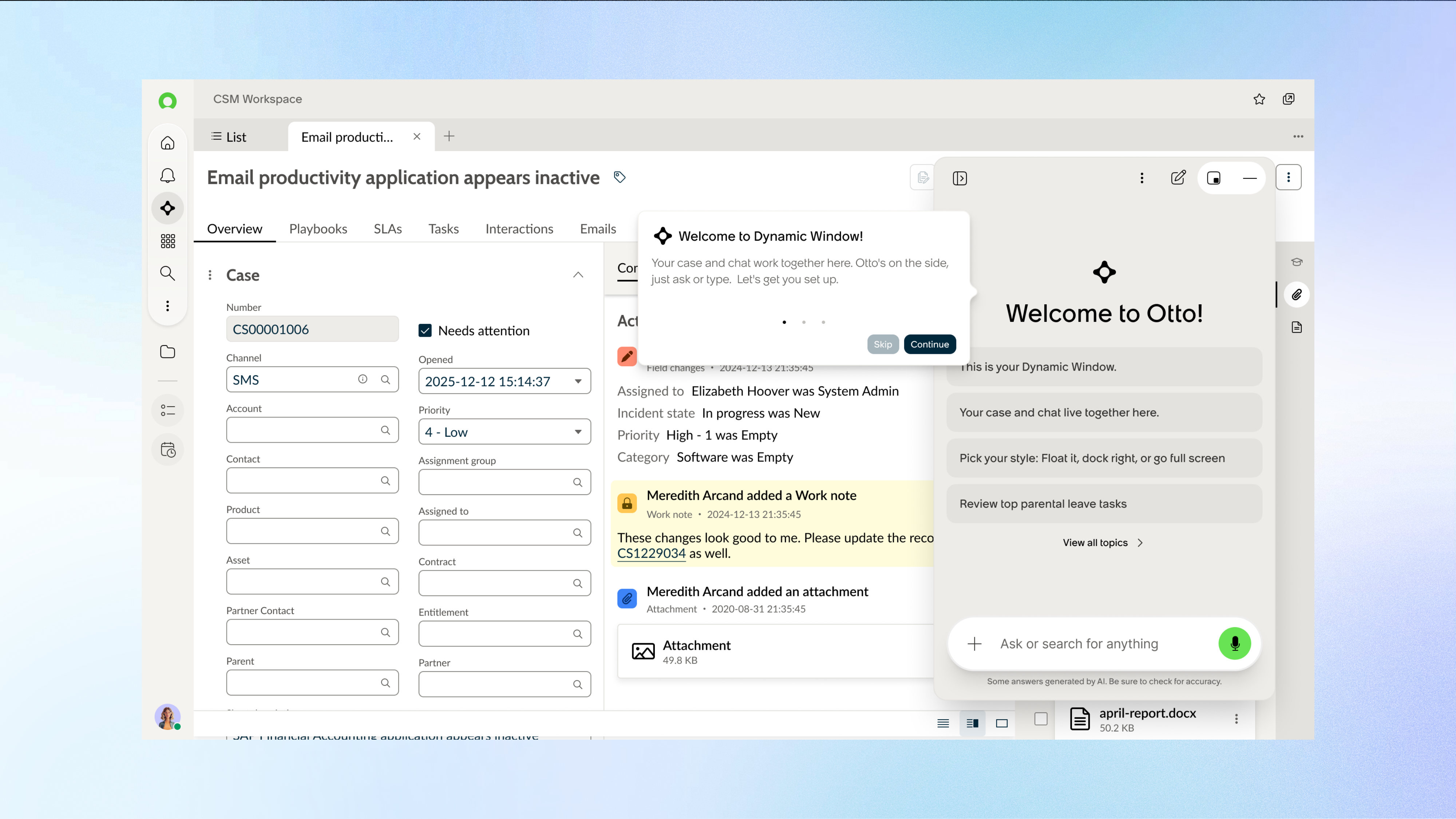
Dynamic Window is an AI workspace where users interact with AI while staying in their current workflow. This project focused on simplifying the header so six core actions could be found faster and understood more consistently across all states.
Rather than redesigning the entire workspace, the challenge was to make a small but high-frequency surface feel more obvious, more teachable, and less visually fragmented.
Discuss this project ↗I focused on how the header should teach itself while still feeling lighter and more consolidated.
The redesign aimed to reduce hunting across states and create one more predictable control surface.
The final proposal paired a cleaner header structure with tooltips that improved first-use understanding.
Challenge
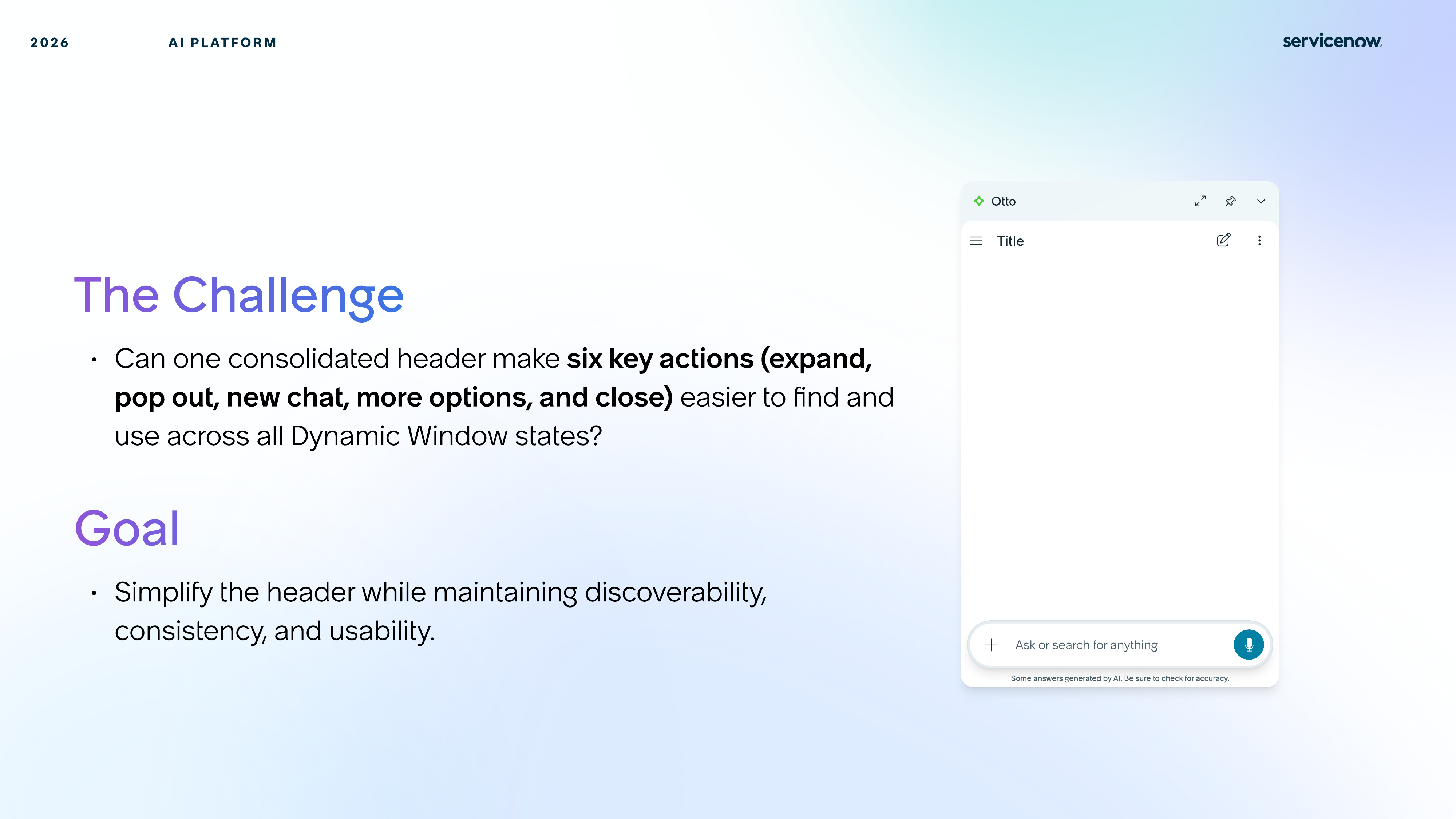
Expand, pop out, start a new chat, close, and related controls all needed to feel consolidated and consistent. The goal was to reduce friction without hiding power.
The header needed to unify six key actions so users could find them more quickly no matter which Dynamic Window state they were in.
The design could not simply remove controls. It had to preserve usability while making the surface feel less busy and more coherent.
Users move between multiple DW states, so the pattern needed to remain stable enough to build confidence instead of forcing relearning.
Onboarding tooltips became part of the solution so the simplified header still taught itself on first use.
Context
Because DW lives beside active product work, even a small control surface has to feel intuitive immediately. The header mattered because it shaped how discoverable the whole assistant felt.
Exploration
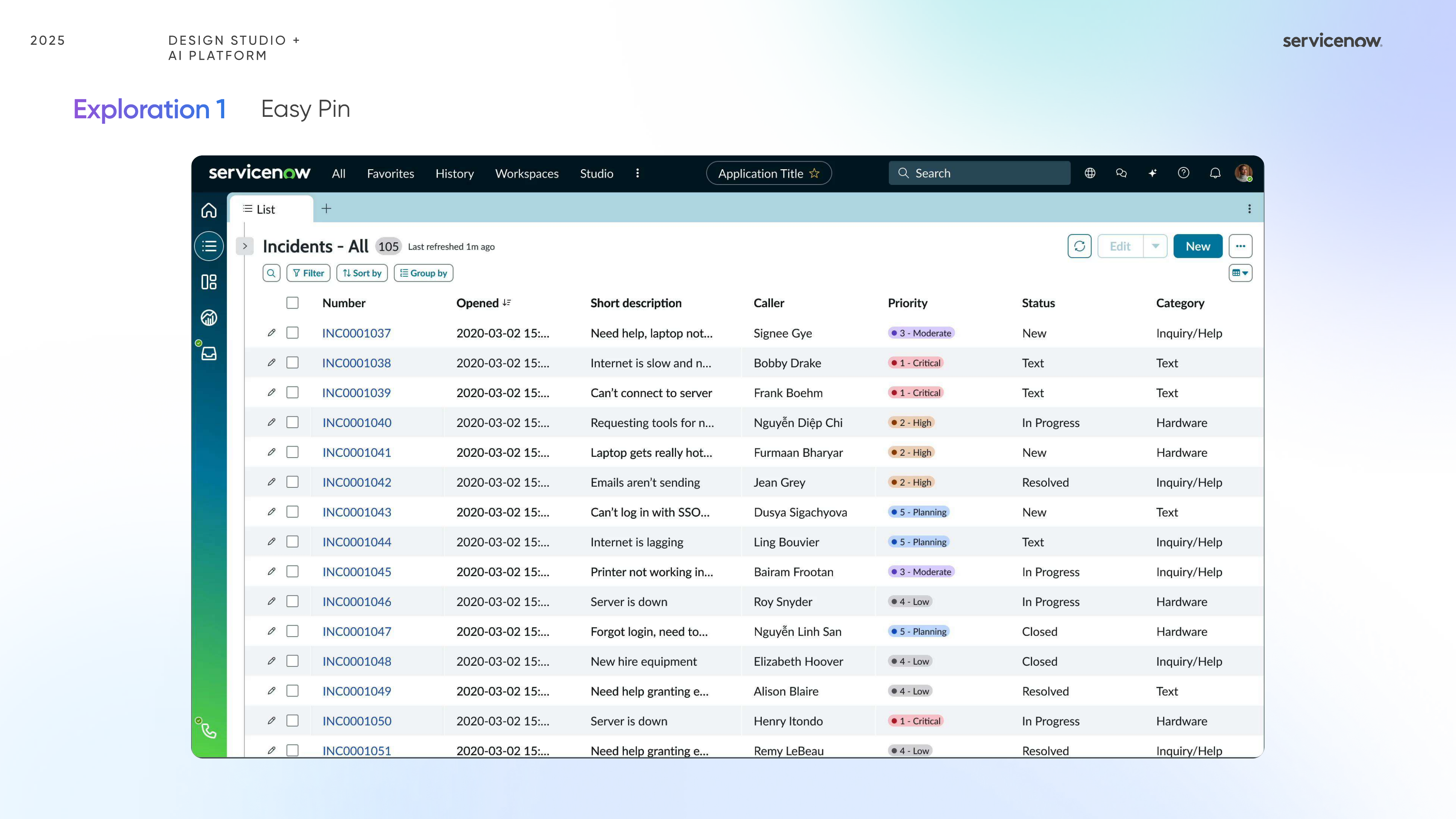
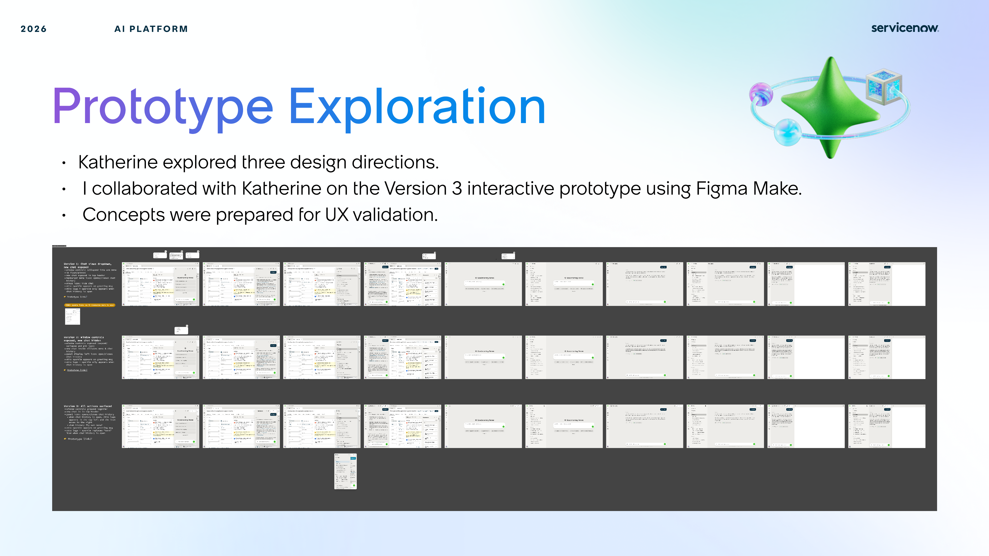
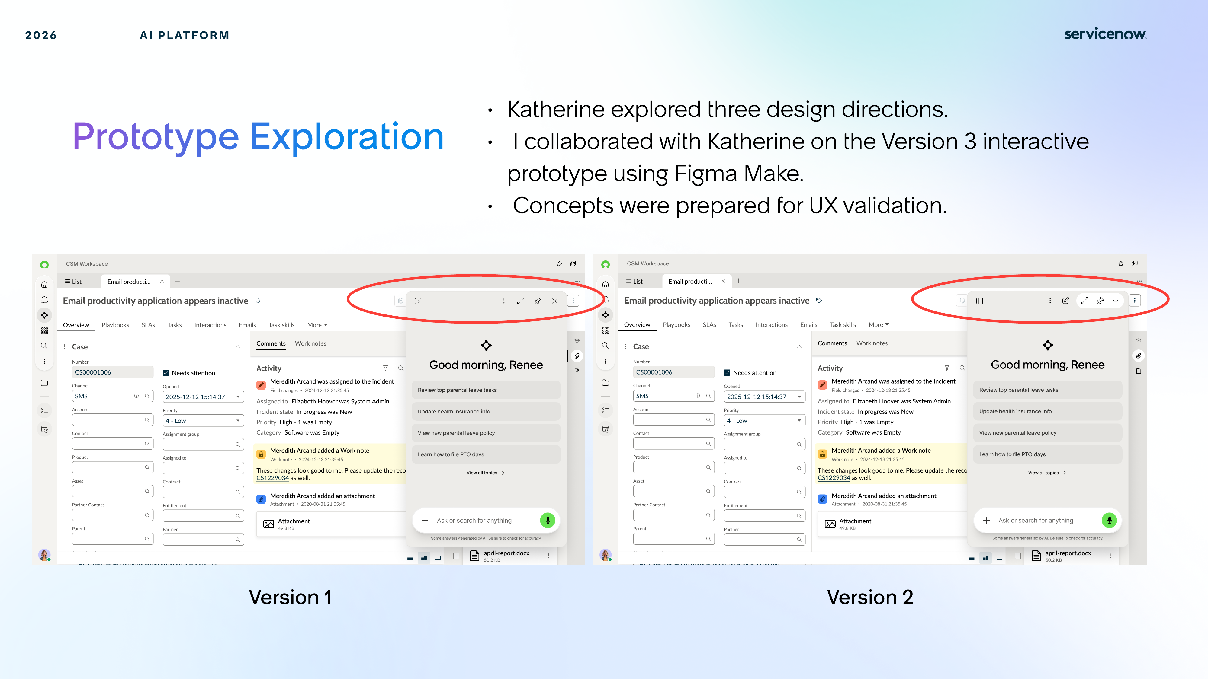
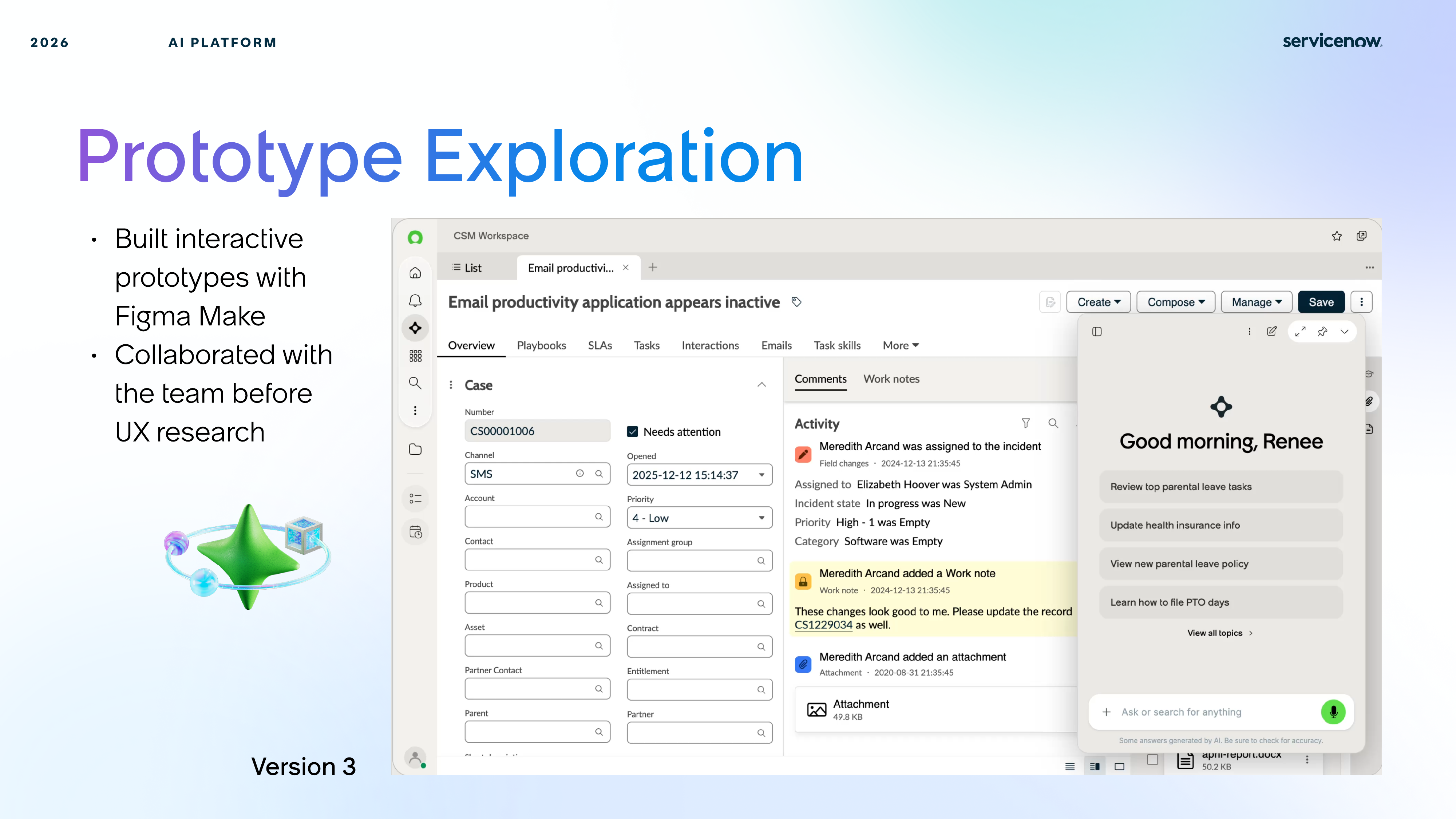
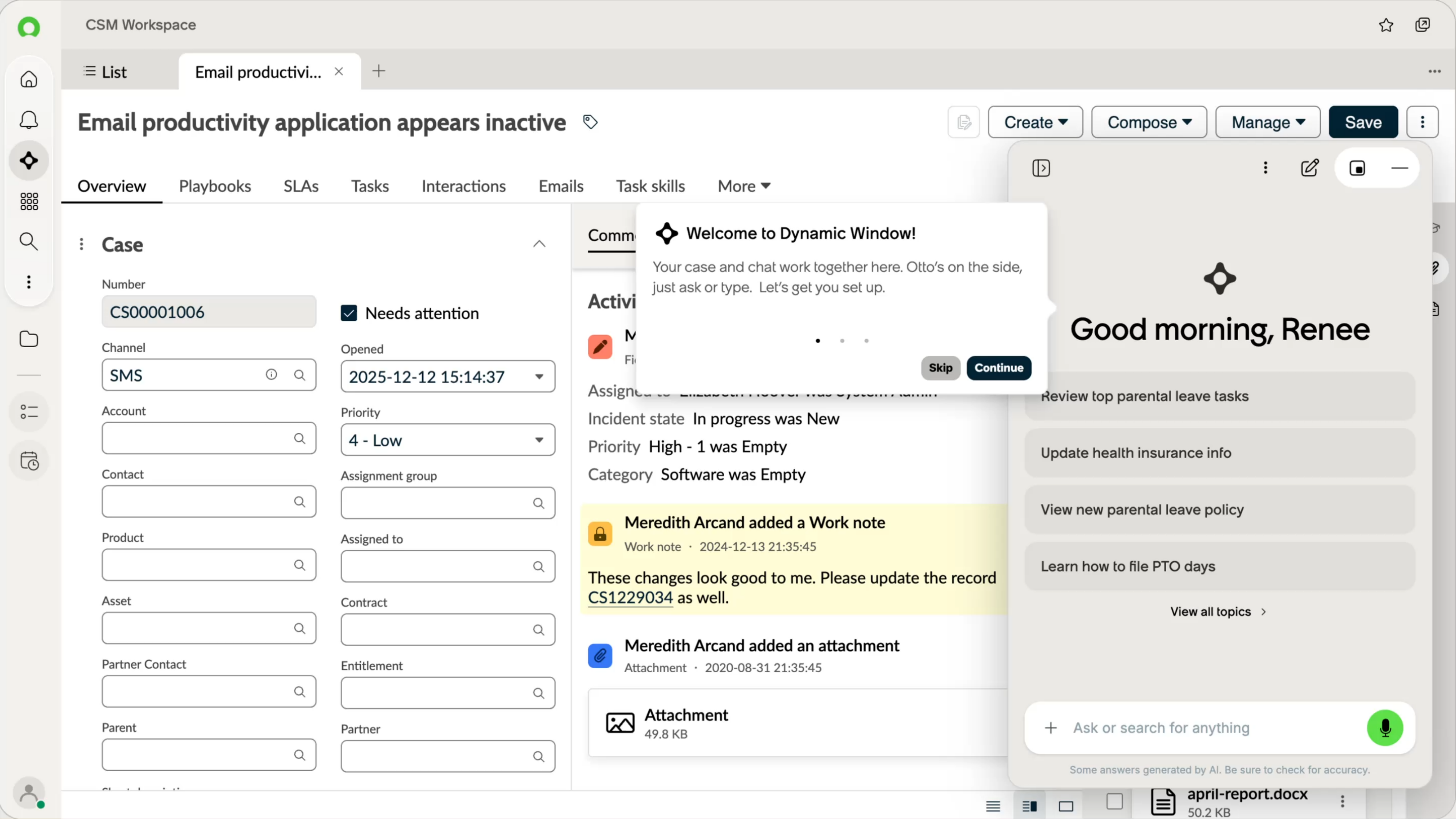
Katherine explored three directions first, and I collaborated on version three using Figma Make to create a higher-fidelity interactive prototype ready for UX validation.
Research
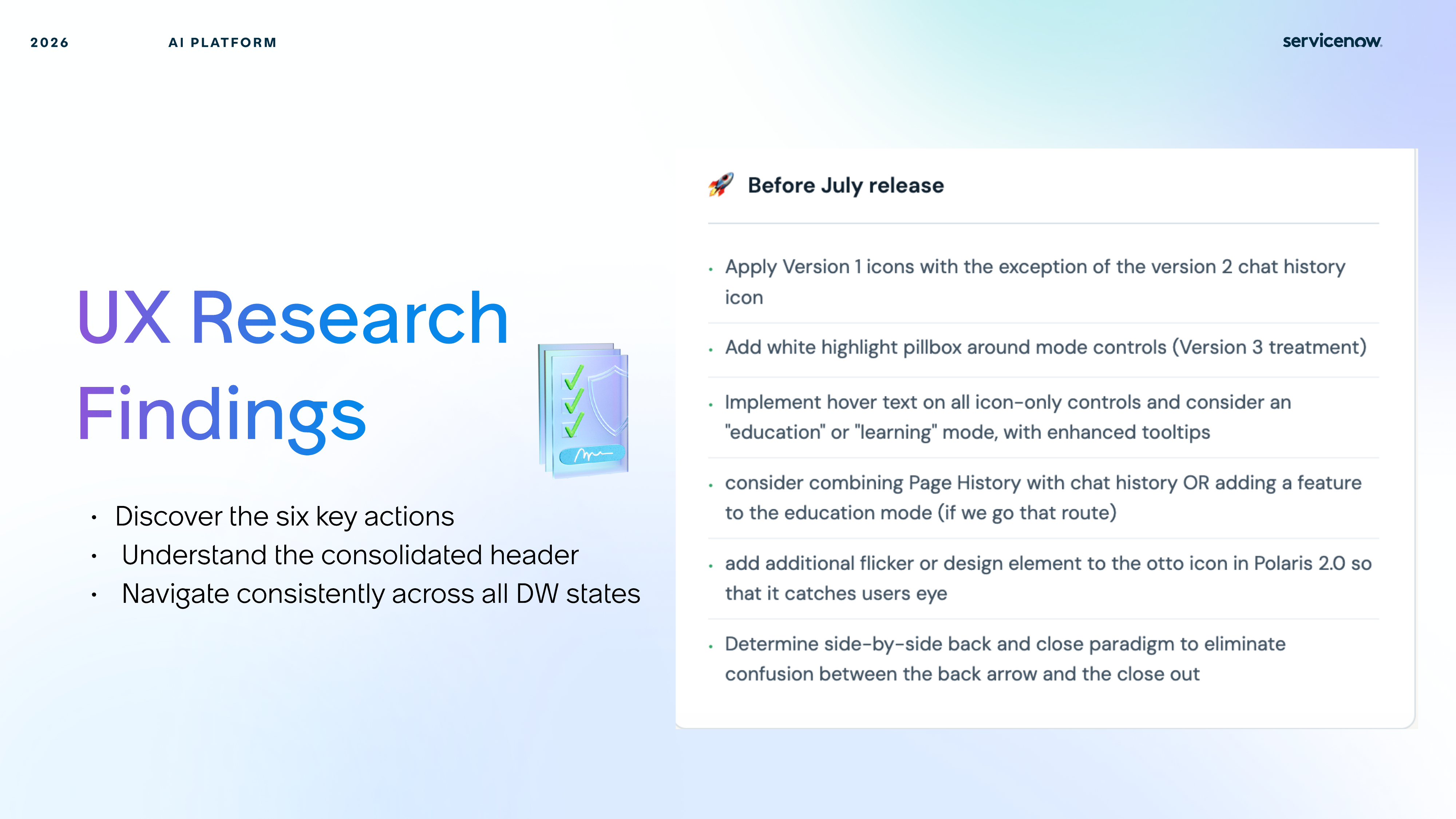
UX research tested whether users could discover the six actions, understand the new consolidated header, and navigate consistently across all Dynamic Window states.
The simplified header had to make actions easier to spot immediately, especially for first-time users.
Onboarding cues helped users understand why the header changed and what each control now represented.
Users built confidence faster when the same header logic held up across every DW layout variation.
Final Design
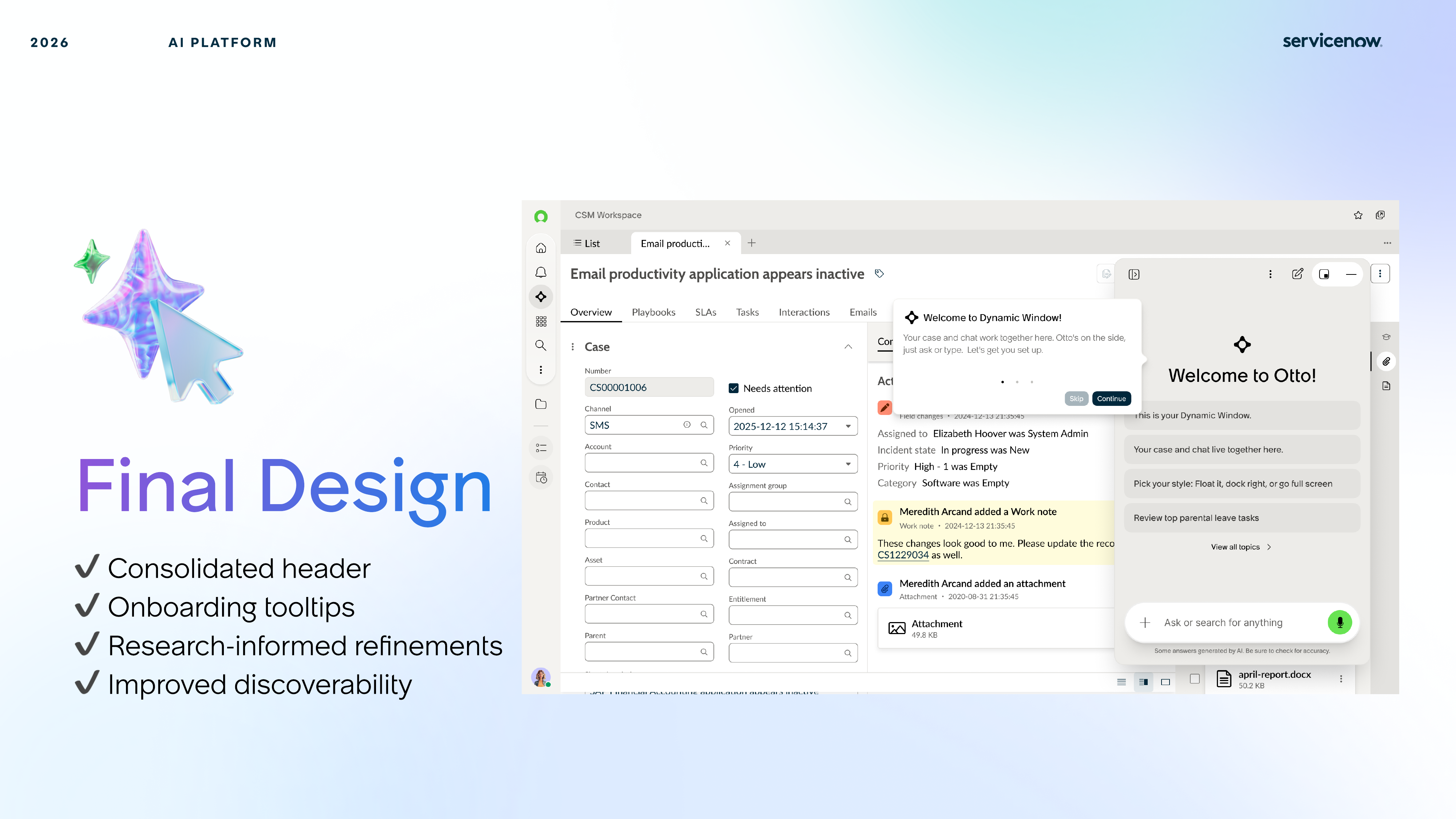
The final proposal introduced one cleaner control surface, supported by tooltips and research-informed refinements that improved discoverability without making the UI louder.
The consolidated header reduced the sense that controls were scattered or changing unpredictably across Dynamic Window states.
The onboarding layer explained the new structure just enough to help first-time use, without turning the experience into a tutorial.
The final details were informed by how quickly users understood the new grouping and whether they could move across states without hesitation.
Reflection
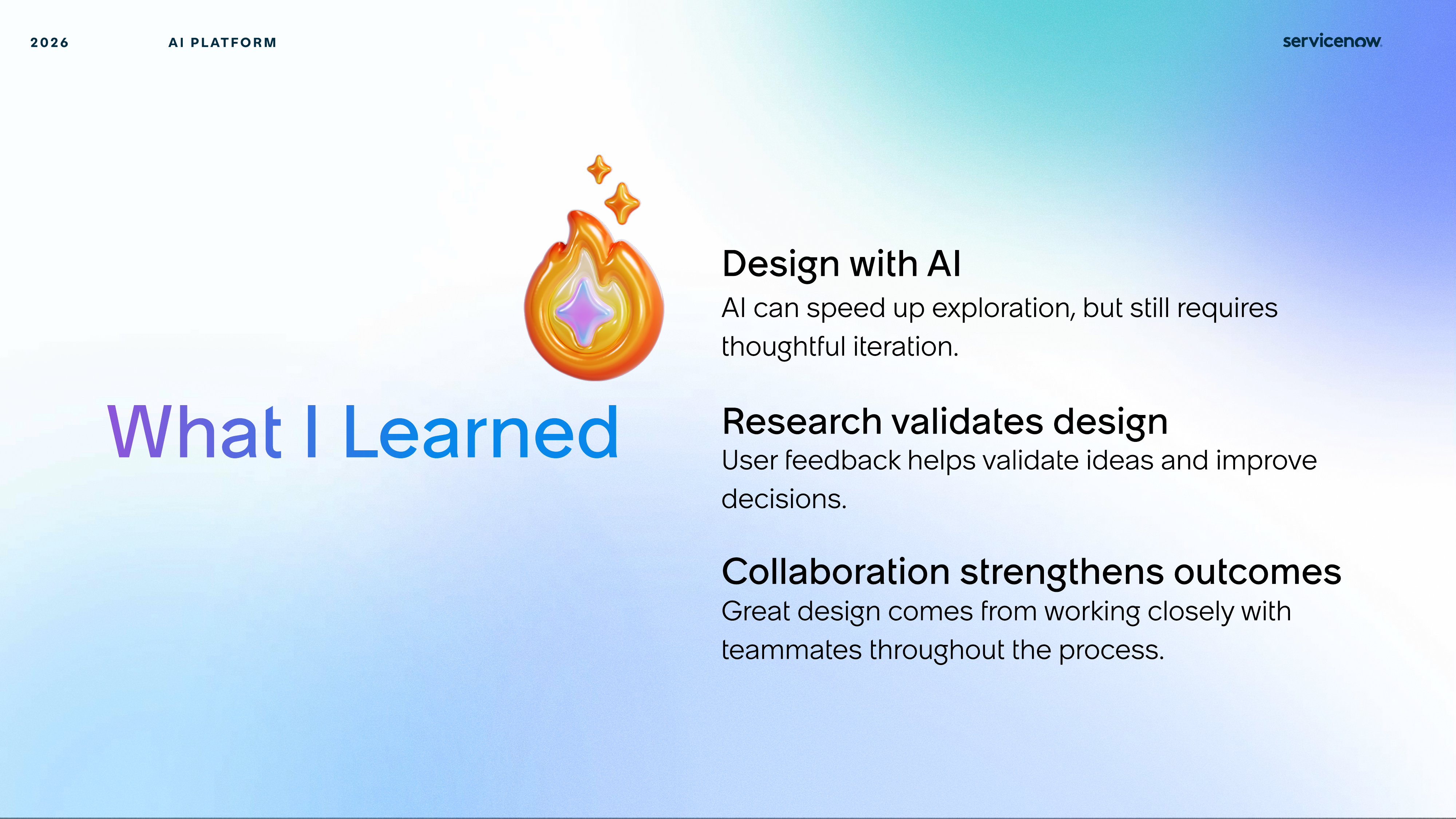
The final takeaways were not only about header simplification, but also about using AI-assisted making, rapid prototyping, and user feedback together to make a smaller workflow decision much stronger.
Figma Make helped the team move from concept to interactive prototype faster, making discussion and testing more concrete.
User testing clarified whether simplification actually improved comprehension instead of merely reducing visual noise.
Working across design directions and prototype iterations made the final header feel more intentional and more defensible.